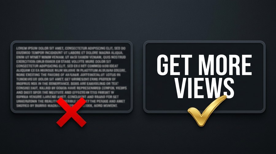
Thumbnail text is a lever, pull it too little and the image lacks direction, pull it too much and it becomes unreadable noise. The question of how much text belongs on a thumbnail has a clear data-backed answer in 2026, and most creators use far more text than the evidence supports.
30%
Higher CTR for thumbnails with 4 words or fewer
1–2
Words used by many top-performing thumbnails
0
Words needed when image tells the full story
What the Data Shows
Research across multiple thumbnail analytics platforms in 2026 consistently finds that thumbnails with 4 words or fewer achieve approximately 30% higher CTR than thumbnails with more text. The most extreme performers, viral videos with 8–15% CTR, frequently use 1–3 words or no text at all. This is counterintuitive for creators who believe more information leads to more clicks, but the data is clear: the thumbnail's job is not to inform, it is to intrigue.
Why Less Text Works
The viewer has 1.5 seconds to decide whether to click. In that window, the visual is processed before the text. If the visual already communicates the emotional hook, a shocked face, a dramatic result, a striking image, text becomes redundant. When text is present, the brain shifts from visual processing to language processing, which takes longer. The most effective text in thumbnails is text that adds something the visual cannot convey alone, not text that restates what the image already shows.
The 4-Word Rule in Practice
The 4-word limit is a ceiling, not a target. Think of thumbnail text as a billboard, you have a fraction of a second at highway speed. The words that work are words that create an open loop: "It Worked," "They Were Wrong," "You Won't Believe," "The Truth Is." These phrases imply a story without completing it. The viewer clicks to close the loop. Phrases that explain or describe, "How to Build a YouTube Channel From Scratch in 30 Days", belong in the title, not the thumbnail.
When to Use Zero Text
Some of the most effective thumbnails in 2026 use no text at all. This works when the image is visually self-explanatory and inherently curiosity-inducing, an unusual result, an extreme before/after, or a visually dramatic scene that raises an obvious question. No-text thumbnails depend entirely on the title to provide context, which means the title must do more work. They also tend to perform better in visual-first niches like food, travel, and art, where the image is the product.
Common Text Density Mistakes
Repeating the title, the thumbnail and title are seen simultaneously; using the same words in both wastes the thumbnail's communication slot
Multiple text layers, a headline plus a subheadline plus a badge creates three competing reading tasks at mobile size
Small secondary text, "Part 2," "Full Tutorial," "2026 Edition" added in small text reads as visual clutter and is invisible on mobile
Long complete sentences, thumbnail text is not a sentence, it is a fragment. Fragments are faster to parse
Test Your Text Density
Use Thumbnail Swiper's split test tool to compare a high-text and low-text version of your thumbnail side by side.
Have a question, suggestion, or found a bug? Send us an email and we'll get back to you as soon as possible.
jaythecreator.info@gmail.com
Click Copy or highlight to select
About Us
Thumbnail Swiper, Built for YouTube Creators
Thumbnail Swiper is a free, no-login toolkit built for YouTube creators who take their thumbnails seriously. Everything runs in your browser, fast, private, and always free.
What We Built
We noticed that the tools creators actually needed, downloading thumbnails, previewing how they look on YouTube, split-testing ideas, and reverse-engineering competitor designs, were either paywalled, or just didn't exist. So we built them all in one clean, fast, free tool.
What You Can Do Here
Download any YouTube thumbnail, in every available resolution, instantly
Preview your thumbnail on a realistic YouTube home feed mockup
Split test up to three thumbnails side by side before you publish
Recreate a competitor's thumbnail using an AI prompt you can paste into any image generator
Our Philosophy
No account required. No watermarks. No limits on downloads. We believe creator tools should be accessible to everyone, whether you have 100 subscribers or 10 million.
Privacy First
We may collect limited data to improve your experience. We are committed to handling any such data responsibly and will always be transparent about what we collect and why. See our Privacy Policy for full details.
Contact
Have a suggestion, found a bug, or want to collaborate? Use the Contact link in the footer. We read everything.
Privacy Policy
Effective date: June 2026
The short version: Thumbnail Swiper does not directly collect personal information through the tool. Third-party services like Google AdSense may use cookies for ad personalization. See Section 4 for details on how to opt out.
1. Who We Are
Thumbnail Swiper is a free online tool that allows users to download YouTube video thumbnails and access related creator utilities. This policy explains our approach to your privacy.
2. Information We Currently Collect
As of the effective date of this policy, Thumbnail Swiper does not directly collect personal information through the tool itself. However, third-party services we use (such as Google AdSense) may collect certain data automatically. We do not currently collect or store:
Your name, email address, or any personal identifiers
YouTube URLs you paste into the tool
Images you upload for the preview or split-test features
Your IP address or location data directly
Browser fingerprints or device information directly
This may change in the future. If we begin collecting additional data, this policy will be updated accordingly.
3. How the Tool Works
Core functionality, thumbnail fetching, image preview, split testing, and prompt copying, is designed to run in your browser. When you paste a YouTube URL, your browser retrieves the thumbnail directly from YouTube's public servers (i.ytimg.com). We do not intentionally store or log the content of your searches. Third-party services embedded in the site (such as advertising networks) may operate independently and are subject to their own privacy policies.
4. Third-Party Services & Advertising
Thumbnail images are fetched from YouTube's public CDN (ytimg.com), which is operated by Google. Your use of YouTube content is subject to Google's Privacy Policy. We have no control over and no visibility into those requests.
Google AdSense: Thumbnail Swiper may use Google AdSense to display advertisements. Google AdSense is a third-party advertising service operated by Google LLC. Google and its partners may use cookies and similar tracking technologies to serve ads based on your prior visits to this site or other sites on the internet. These cookies allow Google and its partners to serve ads to you based on your visit to Thumbnail Swiper and/or other sites on the internet.
You may opt out of personalized advertising by visiting Google's Ads Settings, or by visiting aboutads.info to opt out of a third-party vendor's use of cookies for personalized advertising.
Thumbnail Swiper is not directed at children under 13. We do not knowingly collect any information from children.
6. Changes to This Policy
If this policy changes materially, we will update the effective date above. Continued use of Thumbnail Swiper after any changes constitutes acceptance of the updated policy.
7. Contact
Questions about this privacy policy? Since we collect no user data, there is no account system or data request process. For general inquiries, use the Contact link in the footer of this site.
Terms & Conditions
Effective date: June 2026
The short version: Thumbnail Swiper is a free tool for personal and research use. Use it responsibly. We provide it as-is with no guarantees. Don't use it to infringe copyright or violate YouTube's terms.
1. Acceptance of Terms
By accessing or using Thumbnail Swiper ("the Site," "the Tool"), you agree to be bound by these Terms and Conditions. If you do not agree, please do not use the Site. We reserve the right to update these terms at any time, continued use of the Site after changes constitutes acceptance.
2. What Thumbnail Swiper Does
Thumbnail Swiper is a browser-based utility that retrieves publicly available thumbnail images from YouTube's content delivery network (ytimg.com). It also provides creator tools including a YouTube feed preview mockup, a thumbnail split-test viewer, and an AI prompt generator for thumbnail recreation. All processing occurs client-side in your browser.
3. Permitted Use
You may use Thumbnail Swiper for:
Personal research and educational purposes
Downloading thumbnails of videos you own or have rights to
Analyzing thumbnail design and composition for creative inspiration
Preview and testing of your own thumbnail content
4. Prohibited Use
You agree not to use Thumbnail Swiper to:
Download, reproduce, or distribute copyrighted thumbnail images without the permission of the rights holder
Scrape, automate, or bulk-download thumbnails in a manner that violates YouTube's Terms of Service
Use downloaded content for commercial purposes without appropriate rights or licenses
Misrepresent another creator's content as your own
Attempt to reverse-engineer, disrupt, or interfere with the Site
Use the Site for any unlawful purpose
5. Intellectual Property
YouTube thumbnails retrieved through Thumbnail Swiper are the intellectual property of their respective creators and/or YouTube (Google LLC). Thumbnail Swiper does not claim ownership over any thumbnail content retrieved through the tool. Downloading a thumbnail does not transfer any rights to that content. You are solely responsible for ensuring your use of any downloaded content complies with applicable copyright law and YouTube's Terms of Service.
6. Disclaimer of Warranties
Thumbnail Swiper is provided "as is" and "as available" without warranties of any kind, express or implied. We do not guarantee that:
The Site will be available at all times or free of errors
Thumbnails will always be retrievable (YouTube may change its CDN structure at any time)
The tool will meet your specific requirements
7. Limitation of Liability
To the fullest extent permitted by law, Thumbnail Swiper and its operators shall not be liable for any direct, indirect, incidental, consequential, or punitive damages arising from your use of the Site or any content downloaded through it. This includes, but is not limited to, copyright disputes, loss of data, or business interruption.
8. Third-Party Services
Thumbnail Swiper retrieves thumbnail images from YouTube's public CDN. We are not affiliated with, endorsed by, or in any way officially connected to YouTube, Google LLC, or any of their subsidiaries. "YouTube" is a trademark of Google LLC. Your use of YouTube content is governed by YouTube's Terms of Service.
9. Changes to the Service
We reserve the right to modify, suspend, or discontinue Thumbnail Swiper at any time without notice. We shall not be liable to you or any third party for any such modification, suspension, or discontinuation.
10. Governing Law
These Terms shall be governed by and construed in accordance with applicable law. Any disputes arising from your use of Thumbnail Swiper shall be resolved through good-faith negotiation before pursuing any formal legal remedy.
11. Contact
For questions regarding these Terms and Conditions, please use the Contact link in the footer of this site.

 ThumbnailSwiper